Bulo
Tipografies · Jordi Embodas, Noe Blanco · 2012
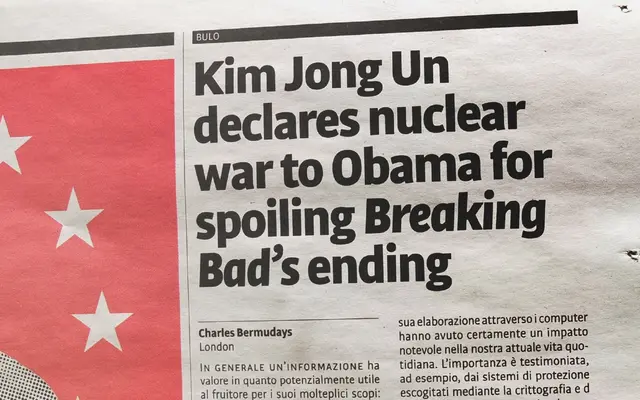
A narrow sans-serif with a generous x-height and short ascenders and descenders, designed specifically for newspaper and magazine typography.
About
Designed by Jordi Embodas and Noe Blanco, Bulo balances a mechanical construction with humanistic details in its lowercase and italics. Its narrow proportions and reduced uppercase height make it economical in use, well suited to tight column widths. Bulo Rounded extends the family with a fully rounded variant in which counters and stroke intersections are also rounded, not merely the terminals.
Classification
Mechanically constructed sans-serif with humanistic inflections, particularly in the lowercase and italics, placing it at the intersection of geometric and humanist traditions.