Foodie
Tipografies · Jordi Embodas, Mucho · 2026
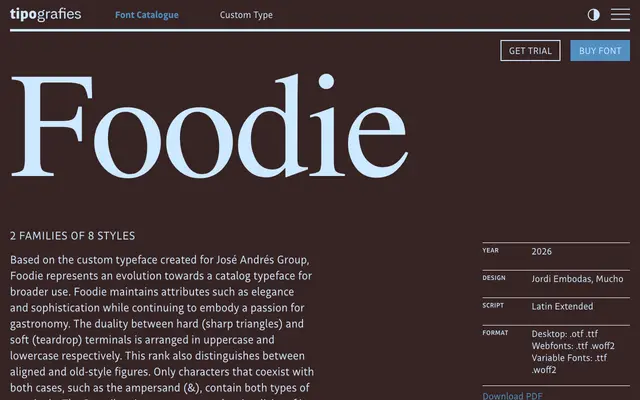
A display serif evolved from a custom typeface for the José Andrés Group, defined by a deliberate contrast between sharp triangular uppercase terminals and soft teardrop lowercase terminals.
About
Designed by Jordi Embodas and Mucho, Foodie began as a bespoke typeface for the José Andrés Group and has been reworked into a catalogue release. The uppercase carries hard, angular terminals while the lowercase uses rounded teardrop endings, and this duality extends to the figure system, where lining figures align with uppercase and old-style figures accompany lowercase. A coordinated Stencil subfamily strips the design back to its structural essentials, making it a practical companion for food, hospitality and editorial contexts.
Classification
A display serif with contrasting sharp triangular terminals in uppercase and soft teardrop terminals in lowercase, giving it a distinctive dual character suited to editorial and branding contexts. The stencil variant reinforces its display orientation.