Sanscise
Tipografies · Jordi Embodas, Mucho · 2018
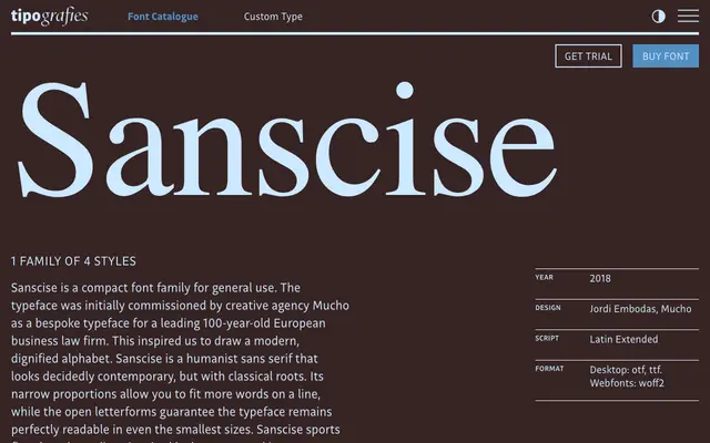
A narrow humanist sans with stone-carved flared terminals, originally commissioned as a bespoke typeface for a European business law firm.
About
Designed by Jordi Embodas in collaboration with creative agency Mucho, Sanscise balances contemporary proportions with classical detailing in the form of flared stroke endings drawn from letterforms carved in stone. The narrow set width lets more text sit on a line without sacrificing legibility, and open apertures keep it readable at small sizes. The family runs to four styles: Regular, Italic, Bold and Bold Italic, with full OpenType feature support including oldstyle figures, ligatures and alternates.
Classification
Tipografies describe Sanscise as a humanist sans serif with classical roots; its narrow proportions and flared stroke endings inspired by stone-carved letters place it firmly in the humanist sans tradition.