Brill
Tiro Typeworks · John Hudson · 2014
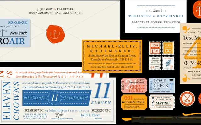
A commission for Brill publishers by John Hudson, carrying approximately 7,000 glyphs per style to cover scholarly and multilingual texts across Latin, Cyrillic and Greek scripts.
About
Originally developed from 2008 for the Dutch academic publisher Brill, the typeface supports more than 2,800 characters including IPA, Uralicist notation, Old Cyrillic, archaic Greek and a comprehensive system of combining diacritics for arbitrary character sequences. Its near-vertical contrast axis and pointed-nib modulation were chosen for their stability when applied to the reversed and rotated letterforms common in phonetic alphabets and certain Cyrillic letters. Recognised at the 2013 Type Directors Club competition, it is now licensed by Tiro Typeworks to publishers and designers beyond Brill's own use.
Classification
Brill uses a near-vertical contrast axis with expansion stroke modulation based on a flexible, pointed nib, placing it closer to a transitional or Enlightenment-era serif model rather than a broad-nib Renaissance style, designed to accommodate reversed, rotated and symmetrical letterforms across multiple scripts.