Meiros
Tofu Type · Reese Lee · 2025
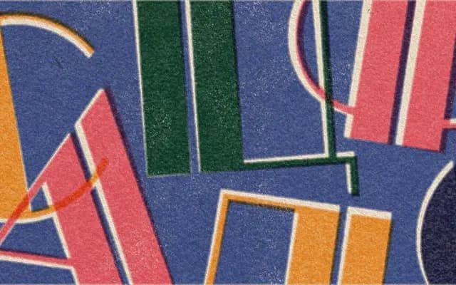
A super high-contrast, all-caps geometric display typeface from Tofu Type, drawn with Art Deco sensibility and exaggerated hairline-to-stem contrast cuts.
About
Designed by Reese Lee as a deliberate stylistic inversion of their humanist work on Renwick, Meiros pushes stroke contrast to an extreme and introduces a cut through each heavy section to balance visual weight and create directional rhythm. The Art Deco movement and the BioShock game series served as primary references, lending the design a theatrical, period-inflected character. Three weight variants cover Latin and Cyrillic scripts, with fifteen stylistic sets offering alternate forms including angled S, serifed I, Bulgarian Cyrillic variants and a hollow zero.
Classification
Classified by the foundry as Sans, display; the extreme stroke contrast, Art Deco inspiration, geometric construction and all-caps orientation place it firmly in the display category rather than functional text sans.