Jeles
Tour de Force · Slobodan Jelesijević · 2015
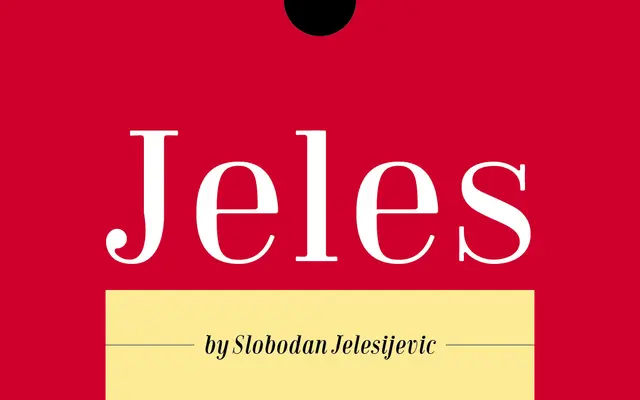
A high-contrast display serif with round slab serifs and ball terminals, suited to fashion, cosmetics and editorial headlines.
About
Designed by Slobodan Jelesijević and released in 2015, Jeles draws on classic high-contrast serif traditions and updates them with soft corners and rounded slab serifs for a contemporary feel. The family spans seven styles across Normal and Condensed widths, with the upright cuts carrying authority for headlines and the italics lending a livelier character to subheadings. Its sturdy thin strokes make it practical for both screen and print, and the decorative quality suits branding work in fashion, jewellery and food.
Classification
A high-contrast serif with round slab serifs, ball terminals and soft corners, designed primarily for display use. The strong thick-thin contrast and decorative detailing place it firmly in the display category despite readable text settings.