Metropola
Tour de Force · Dušan Jelesijević · 2021
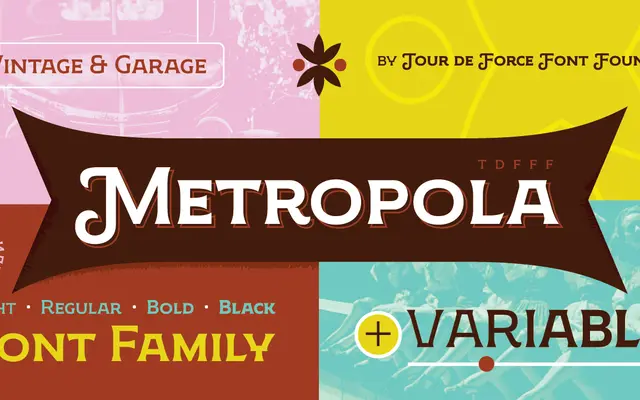
A Victorian-inspired display family in four weights with a variable axis, covering extended Latin and Cyrillic with swash alternates and oldstyle figures.
About
Designed by Dušan Jelesijević and released in April 2021, Metropola takes its cues from Victorian-era display lettering, carrying that genre's expressive weight contrast into a contemporary four-weight family with a corresponding variable version. Each style ships with dingbats and OpenType features including swashes, oldstyle numerals, ligatures and fractions. Extended Latin across 102 languages and a full Cyrillic set broaden its utility beyond purely English-language work.
Classification
Metropola draws on Victorian-era display typefaces with expressive, high-contrast letterforms suited primarily to headlines and titling work. The foundry classifies it explicitly as Display.