Oceanis
Tour de Force · Dušan Jelesijević · 2025
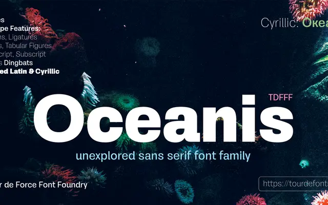
A ten-weight neo-grotesque family by Dušan Jelesijević, modelled on the Helvetica and Arial tradition with Cyrillic support added.
About
Designed with the neutral, compact character of classic neo-grotesques, Oceanis spans ten weights from Hairline to Black with low contrast throughout. The family covers Extended Latin across 102 languages as well as Cyrillic, and ships with OpenType features including standard ligatures, fractions, tabular figures, superscript and ordinals. It positions itself as a general-purpose workhorse rather than a distinctive voice.
Classification
Explicitly described as neo-grotesque, following the tradition of Helvetica and Arial, with low contrast and neutral character — hallmarks of the neo-grotesque genre.