Selektor
Tour de Force · Dušan Jelesijević · 2013
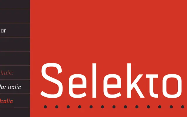
A geometric sans from Dušan Jelesijević with a faint technical character, offered in three weights with matching italics.
About
Designed by Dušan Jelesijević and released in June 2013, Selektor draws from the tradition of technical lettering, lending a few of its characters subtle distinctive terminals that prevent it from reading as entirely neutral. Three weights — Light, Regular and Bold — each come with a matching italic, and all six styles include small caps, fractions and standard ligatures. Coverage extends to 102 languages across Extended Latin, making it broadly applicable for both continuous text and display settings.
Classification
The foundry classifies it as a geometrical sans, inspired by technical lettering. Its geometric construction with characteristic letter endings places it firmly in the geometric sans subcategory.