Werk Sans
Trulytype · 2015
sans-serifgeometric sans
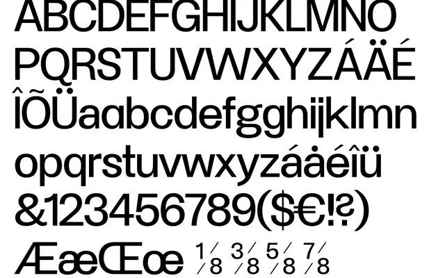
A geometric sans with mid-century references, built for signage, editorial and display work across four weights.
About
Werk Sans draws on the precision of 1920s and 30s geometric type while introducing subtle humanist corrections to keep text readable at body sizes. Four weights with alternates serve a range of applications from magazine headers to poster titles. The extended Latin glyph set covers a broad range of European languages with support for diacritics across Central and Northern European scripts.
Classification
The foundry describes Werk Sans as a modern geometric typeface with roots in 1920s and 30s sans serifs, placing it squarely in the geometric sans tradition alongside contemporaries such as Futura.
Weights
4 weights
Languages
Latin Extended
Tags
geometricsans-serifmid-centurysignageeditorialpostermagazine