Brassia
Tunera · Ariel Martín Pérez · 2019
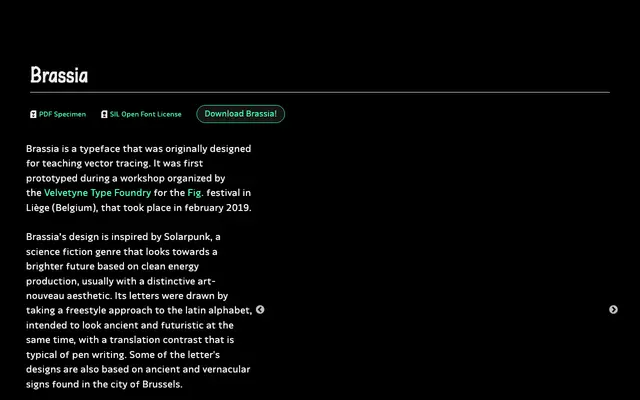
A capitals-only display face rooted in Solarpunk aesthetics and Brussels vernacular lettering, with pen-derived contrast and a deliberately ancient-yet-futuristic character.
About
Designed initially as a teaching tool for vector tracing at a 2019 Velvetyne workshop in Liège, Brassia draws on the art nouveau leanings of the Solarpunk science fiction genre. Its letterforms take a freestyle approach to the Latin alphabet, with translation contrast typical of pen writing and some characters derived from ancient and vernacular signs found in Brussels. The current version is capitals-only, with alternative forms tucked into the lowercase slots; the glyph set may expand depending on demand.
Classification
Brassia's freestyle letterforms draw on art nouveau aesthetics via the Solarpunk movement, with pen-derived translation contrast and vernacular influences from Brussels signage. Its expressive, decorative character places it firmly in the display category.