Luperca
Tunera · Ariel Martín Pérez
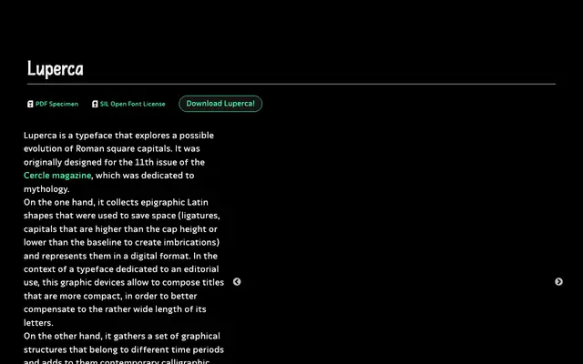
An all-caps display typeface drawing on Roman square capitals, epigraphic ligatures and chisel-engraved serifs, released in five optical sizes for editorial titling.
About
Designed by Ariel Martín Pérez for the mythology-themed 11th issue of Cercle magazine, Luperca adapts epigraphic Latin conventions — including ligatures and letters that overshoot the cap height or baseline to create imbrications — into a digital format suited to compact titling. The letterforms blend sources from different periods: the tail of the Q references the Lyon Tablet, serif construction follows chiselled stone-cutting, while the bar of the E reflects a calligraphic pen rotation. Five optical display sizes are included, all under the SIL Open Font License.
Classification
Based on Roman square capitals with epigraphic Latin shapes, calligraphic details and chisel-inspired serifs, Luperca sits firmly in the display category as an inscriptional or lapidary revival style.