Tanklager
Tunera · Ariel Martín Pérez
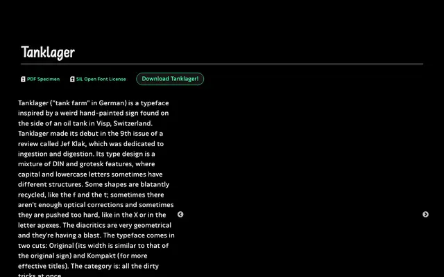
A two-width display grotesque drawn from a hand-painted oil tank sign in Switzerland, mixing DIN geometry with deliberate optical imperfection.
About
Based on a vernacular hand-painted sign spotted on an oil tank in Visp, Switzerland, this typeface blends DIN and grotesk structures with uneven optical corrections that are kept as features rather than fixed. Capital and lowercase letters sometimes follow different structural logic, and the geometric diacritics are treated with unusual freedom. It comes in two widths: Original, which preserves proportions close to the source sign, and Kompakt, suited to headlines and tighter settings.
Classification
Described as a mixture of DIN and grotesk features with irregular optical corrections and geometric diacritics, derived from a hand-painted sign; its intentionally rough, vernacular character places it firmly in the display category.