Alto Mono
TYPE BY · Thomas Thiemich · 2008
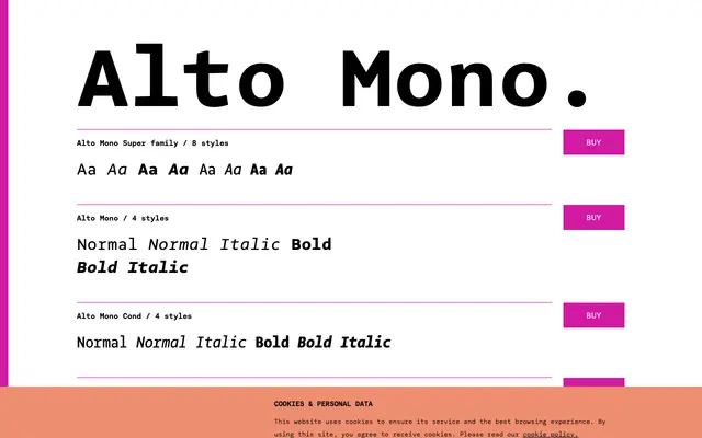
A monospaced extension of Thomas Thiemich's Alto humanist sans family, offered in Normal and Bold weights with a condensed variant.
About
Part of the broader Alto superfamily, which spans Normal, Condensed, Extra Condensed and Monospaced widths, this cut brings true italics and humanist proportions to monospaced work. The design avoids decorative quirks in favour of practical legibility, following the approach of contemporaries such as FF Meta and FF Thesis. Latin-based language coverage is extensive, running from Western European to East European scripts.
Classification
A monospaced variant of the Alto humanist sans-serif family, sharing its true italics and down-to-earth design philosophy rather than the mechanical character typical of grotesque monospaced faces.