Arnhem
TYPE BY · Fred Smeijers
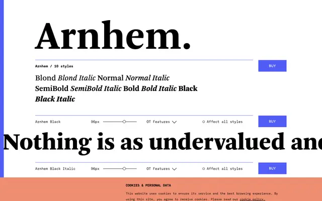
A Dutch text serif by Fred Smeijers, originally cut for the Nederlandse Staatscourant, built for strong colour at small sizes and difficult print conditions.
About
Designed by Fred Smeijers for the daily newspaper of the Dutch state, Arnhem prioritises legibility under adverse printing conditions with a deliberately sturdy colour throughout its weight range. The family runs from Blond to Black, each with roman and italic, plus small caps, lining figures, oldstyle figures and tabular figures as OpenType features. A titling variant (Arnhem Fine) and headline variant (Arnhem Display) extend the system for larger-size work beyond the core text styles.
Classification
Arnhem is a text-optimised serif designed for demanding newspaper conditions, with strong colour, moderate contrast and sturdy construction typical of a transitional model adapted for continuous reading.