Arnhem Cyrillic
TYPE BY · Fred Smeijers · 2020
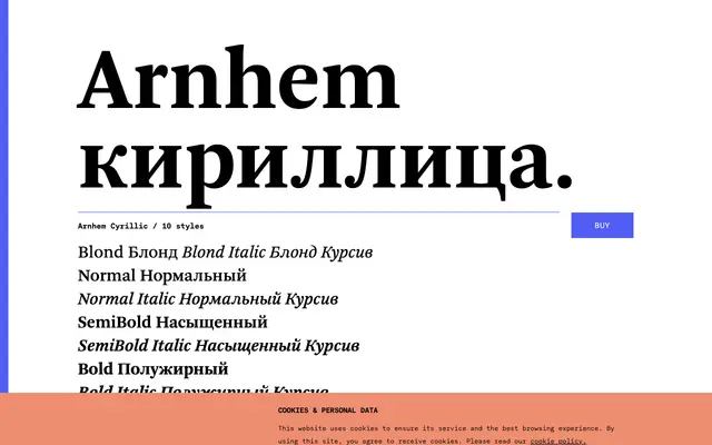
Fred Smeijers's newspaper text serif Arnhem extended to cover Cyrillic, offered in five weights each with matching italics and small caps.
About
Originally drawn for the Nederlandse Staatscourant, Arnhem is a text serif built for demanding conditions: small sizes, suboptimal print, high colour. The Cyrillic extension adds full coverage for Russian and a broad range of related scripts across all ten styles, retaining the small caps, lining and oldstyle figures, and the distinctive Blond weight that sits heavier than a conventional Light. OpenType features include case-sensitive forms, fractions, superscripts and scientific inferiors.
Classification
Arnhem is described as a functional text serif originally designed for a Dutch state newspaper; its robust stroke contrast, small caps and range of weights place it firmly in the transitional serif tradition.