Arnhem Fine
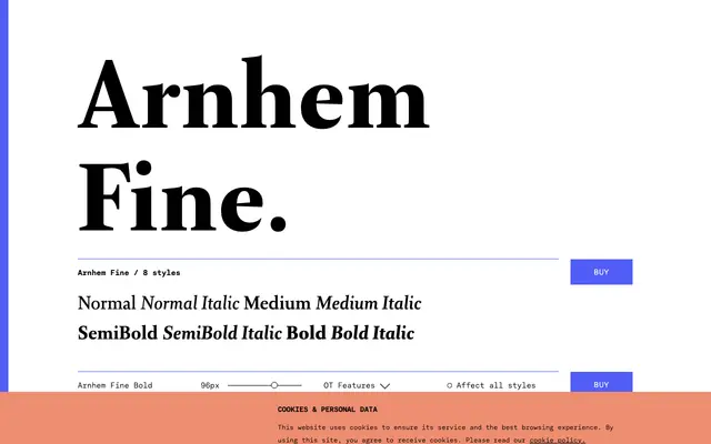
A titling companion to the Arnhem text family, drawn with sharper serifs, longer extenders and a reduced x-height for use at headline and title sizes.
About
Arnhem Fine sits at the display end of the Arnhem superfamily, sharing the formal character of the text cuts but redrawn with crisper details and proportions suited to large sizes. The longer ascenders and descenders give it an elegant page presence, while the smaller x-height and refined curve connections make the drawing more apparent at titling scales. Four weights from Normal to Bold each carry a matching italic, alongside small caps, oldstyle figures and an extensive OpenType feature set.
Classification
Arnhem Fine is a formal serif with crisp display-oriented details including sharp serifs and refined curve connections; it is the titling companion to the Arnhem text family, featuring longer ascenders and descenders and a smaller x-height suited to headline and title setting.