Arnhem Greek
TYPE BY · Fred Smeijers · 2020
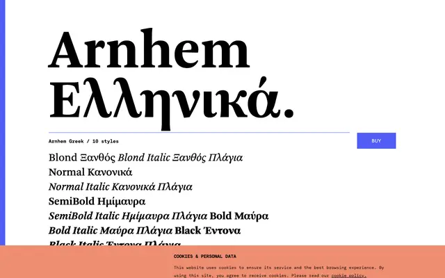
Fred Smeijers's Arnhem extended to Greek script in 2020, giving the five-weight text family full coverage across Latin and Greek for long-form setting.
About
Originally drawn for the Nederlandse Staatscourant, Arnhem is built for demanding text conditions: strong colour at small sizes, sturdy construction and a notably deliberate weight range that replaces a conventional Light with a heavier Blond. The Greek expansion adds ten styles covering all five weights in roman and italic, with small capitals, lining and oldstyle figures, and a full suite of OpenType features. The family sits alongside the Latin-only Arnhem Fine and Arnhem Display subfamilies for titling and headline work respectively.
Classification
Arnhem is described as a functional text serif originally designed for a Dutch state newspaper; its even colour, moderate contrast and sturdy construction place it in the transitional serif tradition adapted for demanding print conditions.