Custodia
TYPE BY · Fred Smeijers · 2003
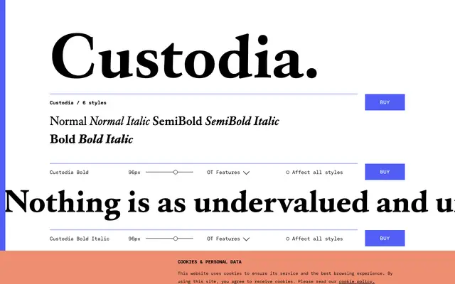
A seventeenth-century-flavoured serif designed by Fred Smeijers in 2002 for the Custodia Foundation in Paris, commercially released in 2003.
About
Originally commissioned for the publications of the Custodia Foundation in Paris, this typeface carries the upright formality and refined detail of Dutch Baroque letterforms. The family offers three weights with matching italics, and the character set is extensive: small capitals, lining and oldstyle figures, small-cap-height figures, discretionary ligatures, fractions, superiors and inferiors. Coverage extends across Latin Extended 1, supporting a broad range of European languages.
Classification
Custodia draws on seventeenth-century letterform conventions with an upright, formal structure typical of Dutch Baroque typefaces, placing it firmly in the historical serif tradition rather than transitional or old-style categories.