Eva
TYPE BY · Merel Wagner, Fred Smeijers · 2006
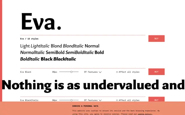
A warm humanist sans by Merel Wagner and Fred Smeijers, inspired by the ceramics of Eva Zeisel, with modest stroke contrast and varied terminal treatments that give it an informal, approachable character.
About
Designed initially as a single weight in 1999 and commercially released in 2006, Eva occupies a considered position between semi-serifs like Optima and humanist sans-serifs like Gill Sans or Scala Sans. Its stroke contrast is present but restrained, and the variety in terminal treatments across its letterforms creates the distinctive warmth the designers drew from Zeisel's industrially produced ceramics. Six weights with matching italics, full small capitals, oldstyle figures, fractions and superior and inferior characters make it equally suited to continuous text and personalised print.
Classification
Eva sits between semi-serifs like Optima and humanist sans-serifs like Gill Sans, with modest stroke contrast and varied terminal treatments that place it firmly in the humanist sans tradition.