Felka Brick
TYPE BY · Thomas Thiemich
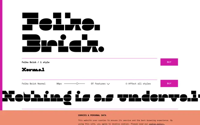
A single-style reversed-contrast display face by Thomas Thiemich that strips capitals to three stacked horizontal bars and the lowercase to two, producing an unusually lively extreme reduction.
About
Part of the broader Felka family alongside Slab, Line and Leaf, Brick draws on 19th-century reversed-contrast types such as Caslon Italian but pushes the principle further by eliminating the thin middle bar from capitals entirely. The result is a design that reads as simultaneously archaic and minimal, with a lowercase that avoids the cold geometric rigidity common to avant-garde experiments of similar ambition. Despite its single weight, the family ships with lining and oldstyle figures, case-sensitive punctuation, stylistic alternates and broad Latin language coverage.
Classification
Felka Brick belongs to a tradition of 19th-century reversed-contrast display types such as Caslon Italian, characterised by thick horizontals and thin or absent verticals, taken here to an extreme minimum with capitals built from three fat horizontal bars and a lowercase reduced to two.