Felka Leaf
TYPE BY · Thomas Thiemich
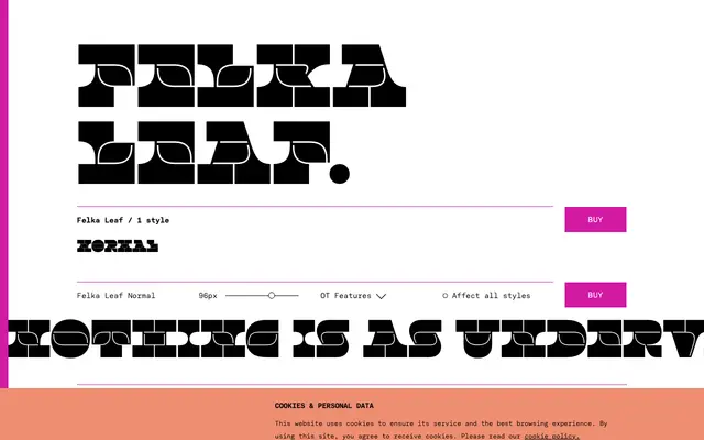
A single-weight display face from Thomas Thiemich that takes the reversed-contrast tradition of Caslon Italian and strips its capitals to three stacked horizontal bars, with a lively two-bar lowercase.
About
Part of the broader Felka suite alongside Slab, Brick and Line, this variant shares the family's core structural idea: capitals built from three fat bars with no thin middle stroke, producing a denser visual impact than conventional reversed-contrast faces. The lowercase counters the geometric reductivism typical of the genre with fluid, organic forms. Suited to display settings where bold, unconventional shapes are needed rather than sustained text use.
Classification
Felka Leaf belongs to a tradition of 19th-century reversed-contrast display faces such as Caslon Italian, where thick and thin strokes are inverted. The 'Leaf' variant is one of four subfamilies (Slab, Brick, Line, Leaf) each offering a distinct surface treatment on the same extreme structural concept.