Felka Line
TYPE BY · Thomas Thiemich
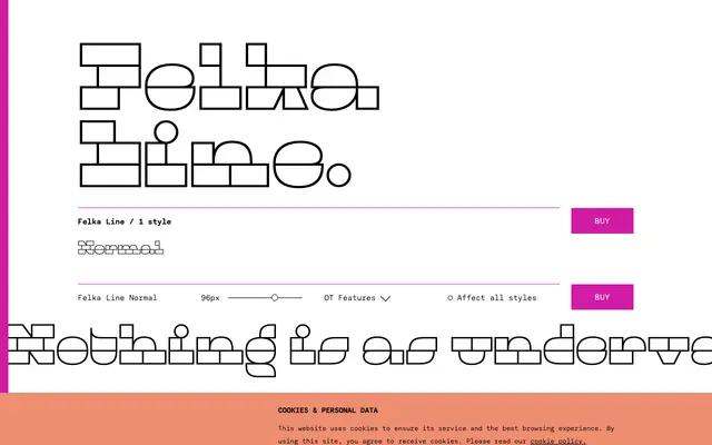
A single-weight display face by Thomas Thiemich that reduces letterforms to stacked horizontal bars, drawing on 19th-century extremes like Caslon Italian while maintaining a lively, fluent lowercase.
About
Part of the broader Felka family alongside Slab, Brick and Leaf, Felka Line strips capitals down to three fat stacked bars and the lowercase to just two, eschewing the thin central strokes typical of this display genre for a stronger visual impact. Where early 20th-century designers reached for pure mathematical shapes under similar constraints, Thiemich's lowercase remains organic and rhythmic. The family carries a full Latin glyph set with lining and oldstyle figures, case-sensitive punctuation, OpenType alternates and broad language coverage across Latin scripts.
Classification
Felka Line is a display typeface rooted in 19th-century extreme designs such as Caslon Italian, with capitals built from three stacked fat bars and a lowercase reduced to two bars, making it firmly a display face with an experimental geometric character.