Fresco
TYPE BY · Fred Smeijers · 2003
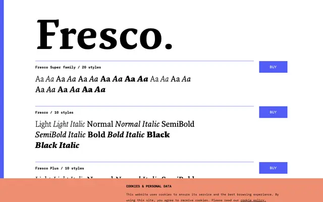
A large multipurpose humanist serif by Fred Smeijers, first shown in 1998 and built for serious text setting across editorial, corporate and book contexts.
About
Designed by Fred Smeijers and commercially released in 2003, Fresco draws on the rhythms of traditional punchcutting while remaining a distinctly contemporary text face. The superfamily spans six sub-families including Fresco Plus, which offers slightly extended ascenders and descenders for closer typographic control, along with sans, informal and script variants. Both Fresco and Fresco Plus share identical kerning and spacing, allowing them to be mixed within a single body of text without disruption.
Classification
Fresco is a contemporary humanist serif with roots in traditional type-making, designed by Fred Smeijers whose work draws on historical punchcutting practice. Its text-first design and warm, readable character place it firmly in the humanist serif tradition.