Quadraat
TYPE BY · Fred Smeijers · 1992
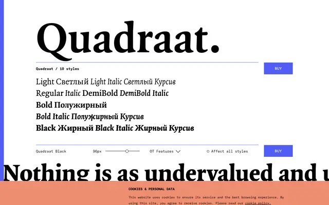
Fred Smeijers's debut commercial typeface, first released through FontFont in 1992, marrying Renaissance proportions with a quietly assertive contemporary construction.
About
Originally drawn for a Dutch design company of the same name of which Smeijers was a co-founder, Quadraat balances Renaissance elegance against a deliberate restraint that keeps it from feeling either decorative or dated. The TYPE BY edition spans ten styles across five weights from Light to Black, each with a matching italic, and carries an extensive OpenType feature set including small capitals, multiple figure styles, historical forms and stylistic alternates for K and R. The family sits equally well in long-form book typography and considered editorial work.
Classification
Quadraat is a serif rooted in Renaissance letterform traditions, drawing on humanist proportions while incorporating contemporary ideas on construction. Its origins in the FF Quadraat family place it firmly in the humanist old-style camp.