Remo Stencil
TYPE BY · Thomas Thiemich · 2012
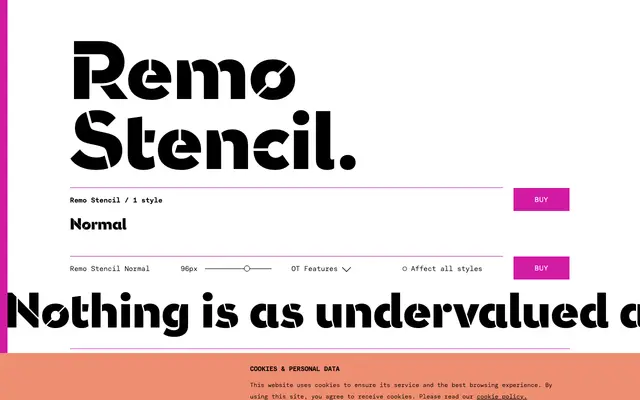
A mid-twentieth-century-inspired stencil sans from Thomas Thiemich, where the breaks are treated as active elements of glyph structure rather than mere interruptions.
About
Part of TYPE BY's Stencil Fonts Series, Remo Stencil sits between the late nineteenth-century Greco Stencil and the contemporary Orly Stencil, drawing on mid-century graphic design sensibility. Its strokes advance, turn and deflect with a mock-serious precision, and the heavy weight makes each stencil break read as structurally dynamic rather than incidental. A contextual alternates feature repositions breaks in adjacent repeating letters, introducing deliberate variety across a text.
Classification
A single-weight stencil typeface with a sans-serif skeleton, classified as display due to its heavy stencil construction and expressive, movement-driven glyph design rather than text utility.