Alphatier™ Pro
Type Culture · 2001
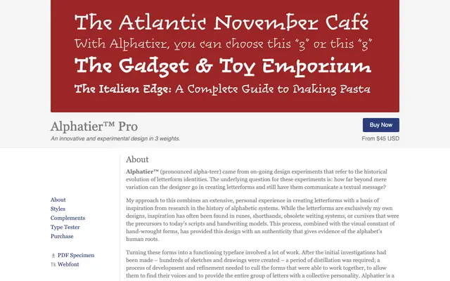
An experimental display typeface drawing on runes, shorthands and obsolete writing systems to push letterforms toward their historical and primordial roots.
About
Available in three weights, Alphatier Pro grew out of sustained research into the history of alphabetic systems, with individual letterforms inspired by runes, obsolete scripts and pre-modern cursives rather than any conventional typographic tradition. The family holds together not through shared structural conventions but through an overlying hand-wrought character, making it suited to display and short text settings where distinctiveness takes priority over neutrality. It won an ATypI typeface design competition prize in 2001 and was recognised by the Type Directors Club of New York in 2002.
Classification
Explicitly designed for display and short text applications, Alphatier departs from conventional letterform conventions, drawing on runes, shorthands and obsolete writing systems to produce an experimental, hand-wrought display face.