Expo Sans™ Inline
Type Culture · 1999
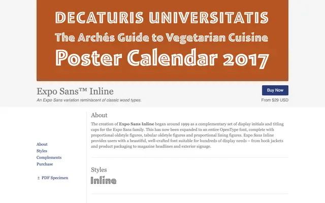
A single-weight inline display font derived from the Expo Sans family, drawing on the tradition of classic wood-type lettering for headlines and titling work.
About
Originally conceived around 1999 as a set of display initials and titling capitals to accompany Expo Sans, the design has since been expanded into a full OpenType font. It includes proportional oldstyle figures, tabular oldstyle figures and proportional lining figures, giving it more flexibility than a typical display face. Suited to book jackets, product packaging, magazine headlines and exterior signage where a decorative inline treatment is called for.
Classification
An inline variant of a sans-serif family, designed as display capitals and titling faces reminiscent of classic wood types. The inline treatment and wood-type heritage place it firmly in the display category.