Expo Sans™ Pro Condensed
Type Culture · 2010
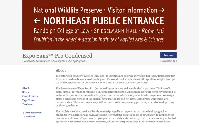
A carefully proportioned condensed cut of Expo Sans Pro, designed for text in tight columns with each glyph narrowed individually rather than mechanically scaled.
About
Development began in 2009 and was completed the following year, with each glyph narrowed by a different percentage — some as much as 50%, others as little as 10% — to preserve optical balance across the family. Five weights from ExtraLight to Bold are available, each with a matching italic, making it a practical choice for newspapers, textbooks and listings where column width is restricted. It sits within the broader Expo Sans and Expo Serif superfamily, inheriting the warmth and readability of the original.
Classification
A condensed variant of Expo Sans Pro, a humanist sans serif noted for warmth and readability, with proportional adjustments made glyph-by-glyph rather than uniform narrowing.