Expo Serif Pro
Type Culture · 2008
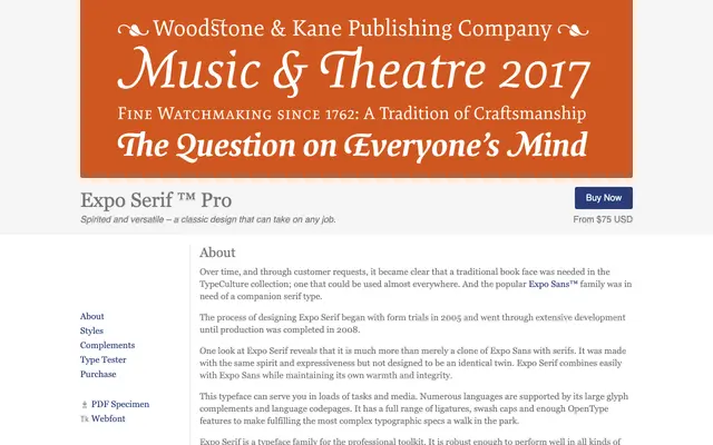
A traditional book serif developed between 2005 and 2008 as a companion to Expo Sans, offering four weights with italics and an extensive OpenType feature set.
About
Designed as the serif counterpart to the Expo Sans family, Expo Serif Pro was developed over three years and released in 2008, winning a Type Directors Club typeface design award in 2009. Four weights run from Light to Bold, each with a matching italic, and the family carries a thorough OpenType complement including swash caps, multiple figure styles, ligatures and fractions. Its large glyph set with broad language support makes it suited to complex editorial and book typography work.
Classification
Described as a traditional book face with warmth and expressiveness, designed for broad text use across print and screen; its pairing with a humanist sans and emphasis on readability place it in the transitional serif tradition.