Belle de Mai
Type Department · Guille Sesenta
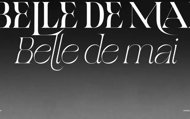
A display serif by Guille Sesenta that draws from the cultural tension between upscale and working-class Parisian neighbourhoods, spanning five weights from Light to Black.
About
Named after the La Belle de Mai neighbourhood in Paris, this typeface pairs classical serif structures with an edgy, contemporary character. The lighter weights carry a tight, delicate energy while the heavier cuts take on a softer, more rounded presence. Ten styles in total, with italics across the range, make it suited to editorial layouts, branding and display work requiring personality across varied scales.
Classification
The typeface blends classical serif elements with an edgy, expressive quality across a wide weight range, positioning it firmly as a display type rather than a text face. Its tension between delicacy and weight makes it closer to a display serif than a pure text serif.