Kritik
Type Department · Daniel Stuhlpfarrer
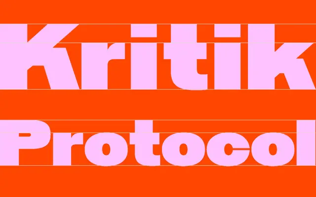
A seven-weight sans-serif conceived for an architecture magazine, pairing angular letterforms with rounded details to reflect the dual nature of critique.
About
Designed by Daniel Stuhlpfarrer and named after the German word for criticism, Kritik juxtaposes sharp, angular characters with softer, rounded forms across seven weights from Light to Black. The concept draws on architectural metaphor, treating contrasting formal elements as structural additions to a scaffold. With old-style figures, optional ligatures and alternates across a 420-glyph set, it suits editorial design, branding and architectural publications.
Classification
Kritik combines angular and rounded forms in a way consistent with geometric sans-serif construction, originally conceived for an architecture magazine context, with a structured, precision-oriented aesthetic.