Lay Grotesk
Type Department · Due Studio
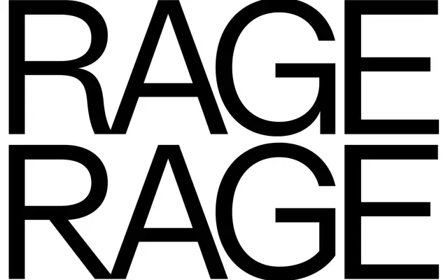
A Swiss-influenced grotesque from Due Studio that softens the rigidity of Helvetica and its peers with reduced letter width and straight terminations at display sizes.
About
Designed by Due Studio, Lay Grotesk takes the neutral tradition of Helvetica, Neue Haas Grotesk and Folio as its starting point, then adjusts contrast and letter width to improve readability at small sizes while letting the geometric character emerge at larger settings. The family runs five weights from Regular to Black with no italics, and 796 glyphs cover Latin Extended-A alongside a full suite of OpenType features including nine stylistic sets and discretionary ligatures. The formal tension between soft and rigid proportions makes it usable across both text and display contexts without committing strongly to either.
Classification
Explicitly positioned as a contemporary reimagining of milestone grotesques including Helvetica and Neue Haas Grotesk, drawing on Swiss typeface principles with softened contrast and geometric terminations.