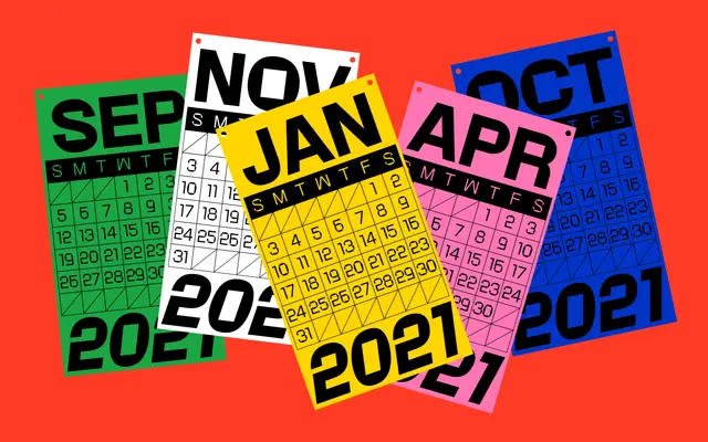
A variable grotesque that sets square-shaped counters against rounded outer strokes, creating a quiet but legible tension across six weights.
About
Rotonto contrasts rigid, square counters with softly rounded outlines, working within grotesque proportions to produce something slightly unusual without abandoning workhorse utility. The family runs from Light to Black with matching italics across all six weights, and is built as a variable font. Its glyph set of 373 characters covers Latin Extended with oldstyle figures, fractions and diacritics, making it workable for multilingual editorial and branding projects.
Classification
Rotonto is built on grotesque proportions and construction, but introduces a distinctive tension between square-shaped counters and rounded outlines, placing it firmly in the grotesque sans-serif tradition with a geometric inflection.