BD Roylac
Type Different · Jacques Loison (original glyphs, 1972) · 2021
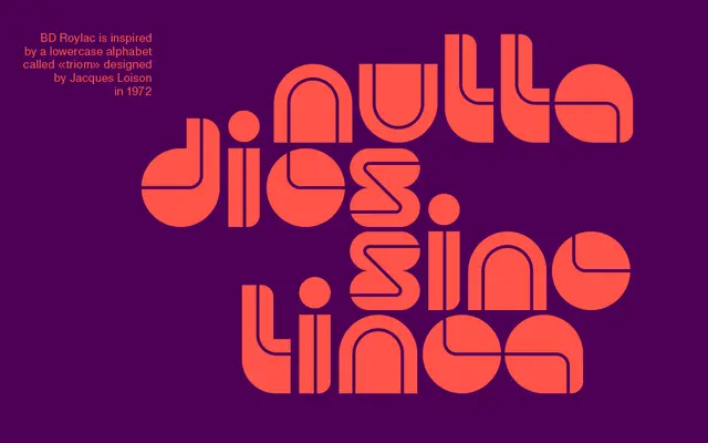
A single-weight display typeface built around a thin curving line that bisects filled letterforms, drawing on lowercase glyphs originally sketched by Jacques Loison in 1972.
About
Each glyph in BD Roylac is defined by a thin, curvy line that splits two filled shapes, sometimes tracing a readable path and sometimes cutting across it for decorative effect. The design revives lowercase characters drawn by Jacques Loison in 1972, with a number of these original forms available through stylistic alternates. Released in 2021, the typeface was created as a tribute to Eric de Broche des Combes on his fiftieth birthday.
Classification
A display typeface with a distinctive split-form construction where a thin curving line divides filled shapes, rooted in 1970s lowercase drawings by Jacques Loison. Its expressive, retro-futuristic character places it firmly in the display category.