BD St.Moritz
Type Different · 2003
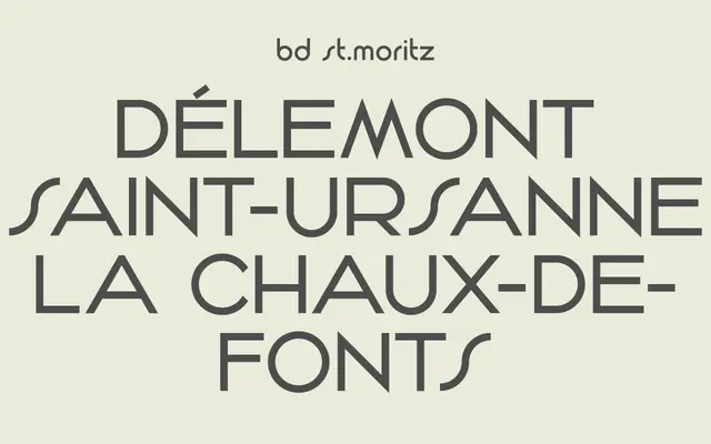
A single-weight display face drawn from Swiss tourism poster lettering of the 1960s, originally released in 2003 and revised in 2023.
About
The design takes direct reference from the hand-lettered and typeset titling found on mid-century Swiss tourist posters, giving it a warm, period character suited to retro branding and editorial work. Only one weight exists, limiting versatility, though the 2023 update improved glyph coverage and kerning. Latin Extended coverage supports a broad spread of Western European languages including Scandinavian and Iberian variants.
Classification
Inspired by Swiss tourism poster typography from the 1960s, the typeface has a period-specific display character that places it firmly in the display category with a retro or vintage subcategory rather than a neutral grotesque.