Eixample Dip
Type-ø-tones · José Manuel Urós, Sabina Chipară
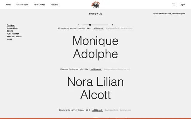
A display family with narrow and inline variants across four weights, designed by José Manuel Urós and Sabina Chipară for Type-ø-tones.
About
Eixample Dip offers four weights from ExtraLight to Bold in both standard and narrow widths, supplemented by a decorative inline cut. The inline style positions the family towards poster and headline work where contrast and ornamentation are welcome. Named after the Eixample district of Barcelona, it carries a regional identity consistent with Type-ø-tones' broader output.
Classification
The inline variant and the decorative 'Dip' naming suggest a display-oriented serif or decorative family, with the inline cut confirming its use for large-scale, attention-grabbing type rather than text settings.