Eixample Glaces
Type-ø-tones · José Manuel Urós, Sabina Chipară
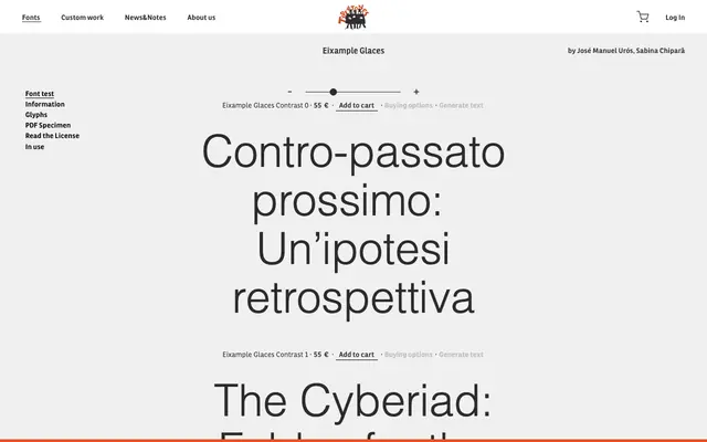
A display typeface by José Manuel Urós and Sabina Chipară structured around three distinct contrast levels rather than conventional weights.
About
Eixample Glaces offers three styles differentiated by stroke contrast rather than weight, named Contrast 0 through Contrast 2. The approach allows designers to shift from low-contrast to high-contrast versions within the same family, suiting editorial and expressive typographic contexts. Released by Type-ø-tones, the Barcelona-based foundry known for experimental Latin typefaces.
Classification
The family is organised around contrast levels (Contrast 0, 1, 2), suggesting a display serif or decorative Latin face built around variable stroke contrast rather than a conventional weight axis.