Joost
Type-ø-tones · José Manuel Urós
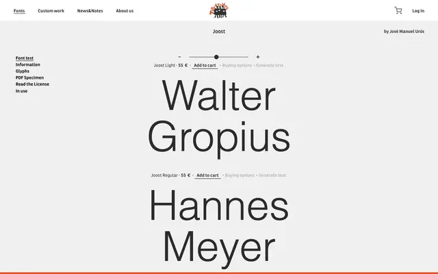
A geometric sans by José Manuel Urós, drawn in the Bauhaus tradition and offered in four weights plus a stencil variant.
About
Joost takes its cues from the Bauhaus school, with specimen text naming Gropius, Moholy-Nagy, Kandinsky and Bayer making the lineage explicit. The family runs from Light to Bold across four weights, with a companion Stencil cut that leans into the constructivist, modular character of the design. It suits editorial, identity and display work where a Bauhaus reference is wanted without reaching for historical revivals.
Classification
A geometric sans with Bauhaus references, including a stencil variant; the naming and specimen text (Gropius, Meyer, Moholy-Nagy, Kandinsky, Bayer) explicitly signal the Bauhaus design lineage.