Memimas Pro
Type-ø-tones · José Manuel Urós
displaydisplay serifitalic
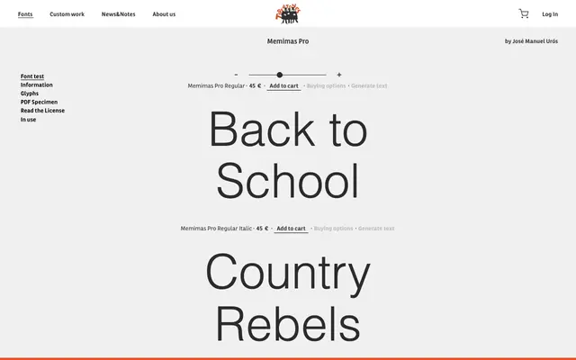
A display serif by José Manuel Urós offered in five weights with matching italics and a decorative dots variant.
About
Designed by José Manuel Urós, Memimas Pro spans five weights from Regular to Ultra, each with a corresponding italic. A Dots variant adds a decorative alternative to the standard cuts, broadening its range for graphic and typographic applications. The family suits headline work, packaging and branding where a lively, expressive serif is called for.
Classification
A decorative display serif with a dots variant and multiple weights suggesting a playful, expressive character suited to headlines and branding rather than body text.
Weights
RegularMediumBoldBlackUltra
Family
Memimas Pro Dots
Languages
Latin
Tags
displayserifdecorativeplayfuleditorialbrandingexpressive