Multi
Type-ø-tones · Laura Meseguer
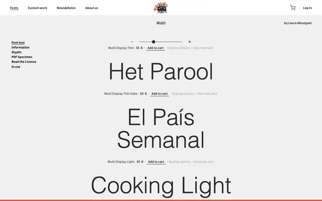
A two-subfamily editorial serif by Laura Meseguer, split into Display and Text optical sizes and used across major international magazine titles.
About
Designed by Laura Meseguer, Multi separates into Display and Text subfamilies, each with its own weight range optimised for headlines and body copy respectively. The Display subfamily spans Thin through Poster with matching italics, while the Text subfamily covers Regular through Bold. Its in-use credits include Het Parool, The New Yorker, Rolling Stone, Billboard and Wallpaper, reflecting a strong track record in demanding editorial environments.
Classification
The family is structured into Display and Text optical sizes with a wide weight range, and the specimen references magazine and editorial contexts, pointing to a contemporary editorial serif with optical size differentiation.