Neeskens
Type-ø-tones · Enric Jardí
displaydisplay serif
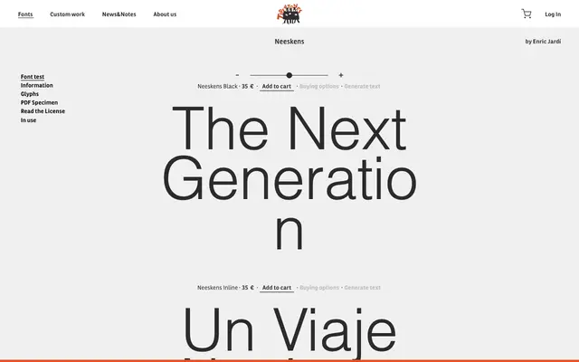
A display typeface by Enric Jardí offered in Black and Inline cuts, built for bold titling and headline use.
About
Designed by Enric Jardí, Neeskens comes in two styles: a solid Black and an Inline variant with a ruled interior to the letterforms. The pairing suits poster, editorial and packaging contexts where strong contrast and decorative weight are called for. The Inline cut adds a secondary register for layered or single-colour typographic treatments.
Classification
Neeskens is a display typeface offered in Black and Inline cuts, indicating a decorative, high-contrast design intended for headlines and titling rather than text setting.
Weights
Black
Family
Neeskens BlackNeeskens Inline
Languages
Latin
Tags
displayinlinedecorativetitlingblackletter-adjacentexpressive