Solida
Type-ø-tones · José Manuel Urós
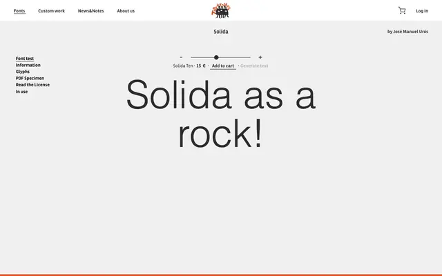
A slab serif by José Manuel Urós from Barcelona's Type-ø-tones, built around a solid, rock-like construction suited to display use.
About
Designed by José Manuel Urós and released through Type-ø-tones, Solida takes its name and character from a deliberately weighty, unyielding slab structure. The family's tagline, 'Solida as a rock!', frames its intent plainly: this is a display-facing slab built for presence rather than extended reading. Type-ø-tones are known for releasing idiosyncratic, culturally specific type, and Solida fits that pattern.
Classification
The name 'Solida' and the tagline 'Solida as a rock!' both suggest a sturdy, heavy slab serif construction; the limited page copy is consistent with a robust, blocky slab design.