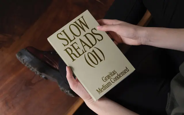
A condensed serif with minimal stroke contrast, built for compact measures where authority and legibility need to coexist.
About
Seven weights from Light to Heavy give this condensed serif a wide tonal range for editorial and brand applications. The minimal difference in stroke weight keeps letterforms solid and even at tight settings, while the condensed proportions lend momentum to longer passages. Glyph coverage includes extended Latin characters with diacritics drawn from South Slavic scripts, suggesting a broader European scope than many single-family releases at this scale.
Classification
A condensed serif with minimal stroke-weight contrast, designed for tight measure text and display work. The condensed proportions and restrained construction place it firmly in the condensed serif category rather than a display or slab variant.