sans-serifhumanist sans
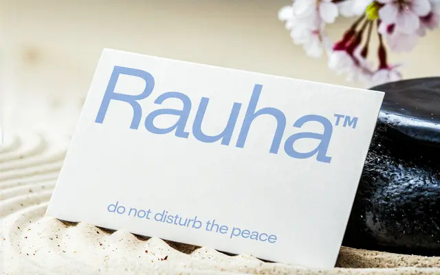
A six-weight humanist sans with slightly open counters and low stroke contrast, designed around a Finnish concept of calm and equilibrium.
About
Inspired by the Finnish word for peace and tranquility, this sans serif balances humanist warmth against geometric structure through modulated proportions and vertical stress. Six weights from Thin to Bold cover editorial and identity work at a range of sizes, with consistent x-height supporting legibility throughout. The glyph set includes extended Latin characters covering South Slavic and Baltic scripts.
Classification
Rauha combines humanist warmth with geometric precision through slightly open counters, low stroke contrast and vertical stress, placing it firmly in the humanist sans tradition.
Weights
ThinExtra LightLightRegularMediumBold
Languages
LatinLatin Extended
Tags
humanistgeometriceditorialidentitylegiblecleanbalanced