sans-serifgeometric sans
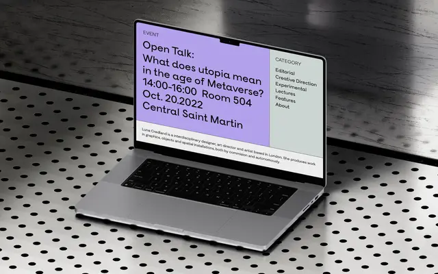
A five-weight geometric sans-serif drawing on circular forms and flat planes, framed around themes of enlightenment and awakening.
About
Five weights from Thin to Bold make up this geometric sans, built around circular letterforms offset by flat planes that the foundry frames as representing a moment of realisation. The glyph set covers Latin Extended with some Cyrillic characters, supporting a moderate range of European languages. Suited to branding and editorial contexts that want clean geometric construction with a considered conceptual footing.
Classification
The foundry explicitly describes Satori as a geometric sans-serif, with circular forms referencing geometric construction and flat planes providing contrast typical of the style.
Weights
ThinLightRegularMediumBold
Languages
Latin ExtendedCyrillic
Tags
geometricsans-serifspiritualminimalcleanmodern