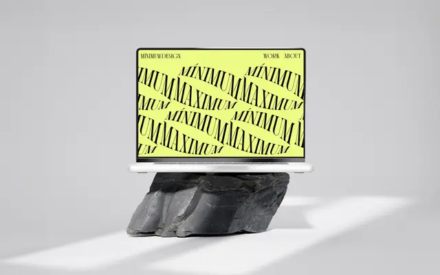
A two-style old style serif with expressive ligature sets and unconventional proportions, designed around the concept of interconnected human experience.
About
Built on Old Style typographic roots with post Neo-Classical influence, Ssonder offers Regular and Italic cuts distinguished by their ligature stylistic sets and deliberate proportional idiosyncrasies. The glyph set covers Latin Extended characters including diacritics for Central European languages alongside a Cyrillic character. Its decorative character makes it better suited to editorial display and branding than to extended body text.
Classification
The foundry describes post Neo-Classical influence with origins in Old Style typographic ideas, placing it firmly in the humanist serif tradition with unconventional proportions and decorative ligature sets.