Plecnik
Type Salon · Krista Likar & Alja Herlah · 2022
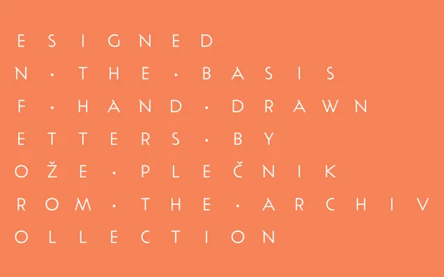
A typeface derived from the letterforms and design principles of the Slovene architect Jože Plečnik, offered in four weights with italics and a Display variant.
About
Rooted in research into Plečnik's extensive archive of inscriptions, book designs and architectural lettering, the typeface draws on classical proportions and humanist terminals with low stroke contrast. Four weights from Light to Bold each include matching italics, while a separate Display style amplifies the most distinctive features of Plečnik's hand. Suited to book and editorial design, branding and packaging where a historically grounded but contemporary serif is needed.
Classification
Described as having classical proportions, humanist stroke endings and low contrast, with sans-serif stroke endings and geometric shapes; sits within a humanist serif tradition despite some mixed sans influences, with a classical structure rooted in Plečnik's architectural lettering.