Sopran
Type Salon · Krista Likar
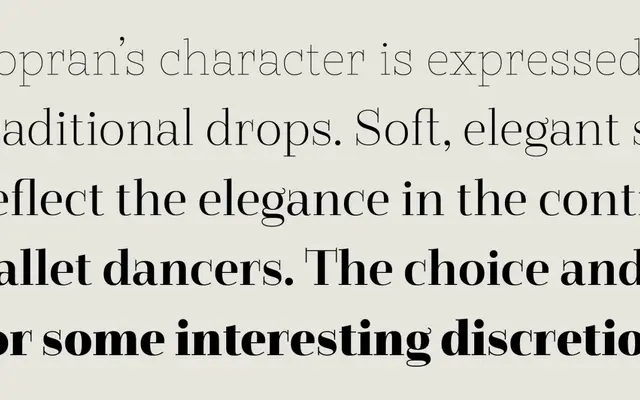
A display serif by Krista Likar built around long straight serifs, extreme weight contrast and playful punctuation drawn with monolinear strokes.
About
Sopran spans five weights from Thin to Black, with contrast moving from near-monolinear at the lightest end to extreme at Black. Long straight serifs replace traditional bracketed drops and enable discretionary ligatures such as "fa" and "Ta". Symbols and punctuation are drawn with monolinear strokes to offset the drama of the letterforms, and two stylistic sets extend typesetting options for headlines, posters, signage and display applications.
Classification
Sopran features long, straight serifs in place of traditional drops, high contrast distributed across weights from monolinear hairline to extreme black, placing it firmly in the display serif category with expressive, poster-oriented characteristics.