Crete
TypeTogether · Veronika Burian · 2007
slabDisplay slab serifitalic
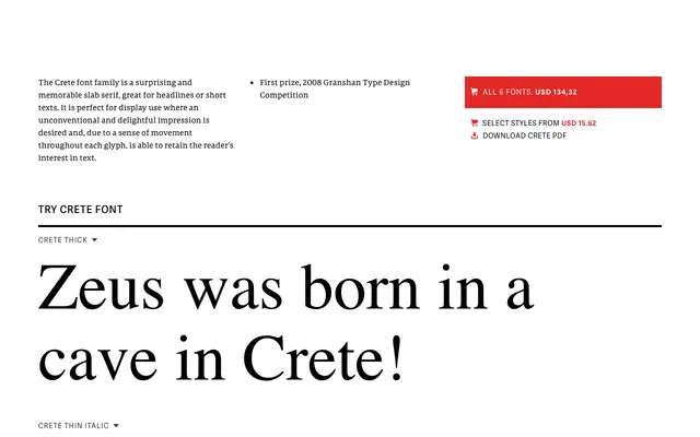
A distinctive display slab that varies serif weight rather than stem width to create three stylistically distinct but metrically interchangeable styles.
About
Crete's unconventional approach — three serif variants (Thin, Round, Thick) that share identical metrics while differing in serif treatment — makes them freely interchangeable in layout without reflowing text. Inspired by wall lettering in a Greek chapel, it won First Prize at the 2008 Granshan Type Design Competition. Available under SIL Open Source Licence via Google Fonts.
Classification
Unconventional slab serif varying serif weight rather than stem width across styles; inspired by Greek chapel lettering; free on Google Fonts
Weights
ThinRegularThick
Family
Crete Round
Languages
Latin
Tags
displayheadlineslab-serifopen-sourcegoogle-fonts